Tuesday, 14 December 2010

Production Of Front Cover

This is my main image, standfirst and title.

 Added to this image are the main coverline, other coverlines and the Buzz word 'Exclusive'.
This is the background i made for the front cover of my pop magazine, i used pink and blue because these colours were my targets audiences favourites.
 Main Image, Title, Coverlines and stand first on the beckground.
This was going to be my final front cover until i reviewed it and decided i had some changes to make including a new front cover image.
This is the new image for my front cover.


This is my final front cover for my Pop music magazine.

Friday, 10 December 2010

Article for double page spread

Lily Allen; a controversial figure in today’s modern music scene, always a hot topic whether it is due to one of her famous rants, dramatic personal life or her latest song sensation, all 3 of which usually cause quite a stir and mix in opinion, but here at Hip Pop, we love Lily! London born, 26 year old Lily varies her musical style from pop to alternative rock and is a successful artist in the modern music scene. Hits such as The Fear, Smile, LDN, Not Fair and Alfie are all hugely popular worldwide as are many of her famous collaborations with stars such as the Kaiser Chiefs to Mark Ronson to Professor Green.  Lily Allen fans are some of the most dedicated fans in the world and when asked what makes them so dedicated many respond with “Bought all her albums, got posters, I attend gigs and I just love her!”  Lily dabbles in many different careers such as singing, song writing, caressing and also being a successful fashion designer who was nominated most for best dressed celebrity in 2008 which was the same year she was awarded Glamourus women of the year and is still now being described by the UK edition of Elle as overly trendy in her fashion choices.  Lily is also well known for putting on a good show, whether she’s playing a small-scale gig, a sell out tour or even headlining at Glastonbury. Fans of Allen love the show that she puts on and one fan describes it, “The atmosphere was amazing, one of my favourite memories”.  Lily puts a huge demand on herself due to the work load she has but it obvious to see that she loves every minute of the life she has. Lily, who is not one to keep her opinions to herself, is also well known for having public rants which always gets alot of media attention, feuds with Katy Perry, Amy Winehouse and Kylie Minogue have all seemed to be due to Lilys remarks about them but when Lily knows she is wrong she is the first to admit it and has apologised to them for her comments. Third Coolest person of the year was awarded to Lily in 2006 with her also winning Hottest Women in POP/RnB the next year, whereas she was also voted number 10 on the most annoying people in 2006 which proves she is the subject of quite alot of controversy. Since Lily shot to fame back in 2006 her private life has become non-existent due to the mass media attention she receives. Her love life and family life are broadcast to the world including stories of being dumped, her abortion and family fall-outs. Father of Lily, Keith Allen, Welsh actor and comedian, has been reported to of expressed how proud he is of his daughter for her career and everything she has been through in life. The father, daughter bond they share is very close and is expressed through interviews and Lily’s twitter page where she has famously tweeted ‘I couldn’t do this without daddy’ about her recent abortion. Stars such as Katy Perry, Pixie Lott, Danni Minogue and many others sent commiserations via twitter because of the abortion, Lily is said to be coping well with the fatality and is medically well considering the trauma she was obviously put through and as a fan has been quoted saying about Lily “she is a true inspiration to her fans and to herself”. It has not been announced as to when Lily will next be touring, but due to the success of her winter 2009/spring 2010 Its Not Me, It’s You tour it is assumed that it will be within the next year. Fans are reported to saying that the main aspect of Lilys music that they enjoy is “her various style of music and her inspirational lyrics” proving she is well loved by the modern day music listeners. Keep up the good work Lily, Here at Hip Pop we love you!

Monday, 29 November 2010

Article Research

Interview Questions
What is it about lily allen that you like?
What is your favourite song by lily allen and why?
Tell me about Lily Allen concert that you went to.
What makes you a dedicated fan to lily allen?
What is it about Lilys music that you enjoy?
Information

  • Lily Rose Beatrice Allen
  • 2 May 1985
  • Pop singer/songwriter/muscian
  • Labels : Regal - 2006-2010 Capitol - 2007-2010
  • Albums : Alright still, Its not me its you

Saturday, 20 November 2010

Photography

Front Cover -
make avatar

Make avatar

This is the photograph i have choosen to use because i believe it conveys the POP genre.


Contents Page -
make avatar

Make avatar

Make avatar


These images will be used on my contents page because they link to the articles and give my magazine the POP genre look.
Double Page Spread -
make avatar

This is the image i will use on my double page spread because it is Lily Allen performing which is the main topic of my article

Tuesday, 16 November 2010

Sketches.

This is a sketch of what i intend my front cover to look like

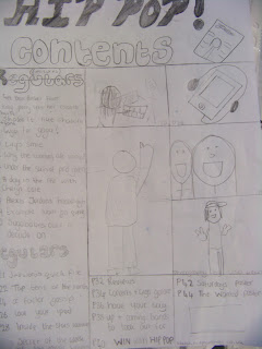
This is a sketch of what i intend for my contents page to look like

This is a sketch of what i intend my double page spread to look like

Monday, 8 November 2010

Planning Production

Front cover images:
Female Pop singer
Ipod and headphones

Coverlines:
Featutres:
Katy Perry lets her colours burst
Gugu for Gaga
Shake it like Shakira
Lily Allen's smile
P!NK is still a rockstar
Why the wanted are so, wanted.


Contents Page Text:
Features:
2 Bieber fever
JB popped in to share his
 success
4 Katy Perry
How shes living her teenage dream
6 Shake it like Shakira
Shakira releases her ‘she-wolf’
8 Gugu for Gaga
Can’t keep a poker face when it comes to lady gaga?
10 Lily’s smile
Lily in the eyes of her adoring fans
12 The Wanted
Filling their fans heart vacancys
14 Professor Green
How he wants a woman to just be good to green
16 Cheryl Cole
Cheryl Cole on her new US success and how she still loves the UK
18 P!NK
Shes still a rockstar!
20 Alexis Jordan’s break-though
New top star? Let’s see
22 Example won’t go quietly
His love for music kick-starts again
24Sugababes, over a decade on
Find out thier secret
Regulars:
26 Jedwards quick fix
Madonna, K$SHA and Glee!
27Top tens of the month
Albums, Singles, Artist Etc.
29 X Factor
This weeks latest gossip on the hottest programme
30 Love your iPod
Your iPod loves you, love it.
31 Stars wardrobes
Sneak peak what they’re
wearing
32 Best kept secret
What the don’t  want us to know
33 Reviews
What’s hot and what’s not
34 Concerts and Gigs
Who, when and where
36 Have Your say
Your emails, letter and texts
38 New stars on the rise
See the new stars on the scene
40 WIN with HIPPOP
Win BIG
42 Saturdays poster
44 The wanted Poster


Editors letter


Images for Contents Page:
girl playing keyboard
Photo of Lily Allen
Photo of Example
iPod and headphones


Double Pge spread + images needed:
Photo Of Lily Allen

Friday, 5 November 2010

Publication Plan

Title:  HIP POP (Ravie)

Positioning Statement: Bringing the hip into pop.

Frequency Of Publication: Monthly

Price: £2.00

Distribution: Newsagents, Supermarkets, Music Shops

Rationale: The approach of the magazine is from the pop music listeners perspective, it will offer information, reviews, interviews and articles on current popular music stars.

Style: Informal, friendly, approiate for teenage girls. Simple vocabulary.

Images will be the dominant feature of layouts.

Regular Content
  • Forum of regular readers
  • Reviews of music
  • Top ten's
  • X Factor secrets
  • Editors Letter
  • Top Concerts in the UK
Feauture Content
  • Gugu for Gaga
  • Lily Allen performs with Example
  • Katy Perry lets her colours burst
  • Justin Bieber time
  • Taylor Swifts real love story
  • Miley gets Smiley
  • Cheryl Cole - a day in the life
  • The Wanted  are wanted
  • Take That, back for good?
  • Cant get Kylie out of my head
  • Shake it like Shakira
  • Up and coming bands of 2011
  • Our lives would suck without Kelly Clarkson
  • The Sugababes chart success over a decade on.
  • The Saturdays show us how it's done
  • Scissor Sisters spice up the charts
  • P!NK is still a rockstar
House Style
Coverlines: Calibri (Body) and  Calibri (Body)
Headlines: Frankline Gothic Demi (Bold)
Standfirst: Calibri (Italics)Captions:Calibri (Italics)
Features First Paragraph:

  • Drop Capital  Frankline Gothic Demi (Bold)
  • 4 lines deep
  • First word in capitals
News first paragraph: First word in BOLD CAPITALS
Body Text: Calibri (Body)
Colour Scheme: Pink, Blue.

Monday, 1 November 2010

Audience Research - Results and Conclusions

How often do/would you buy music magazines?
This shows that 12 out of 20 of my target audience buy/would buy magazines monthly, so i shall make my frequency of publication, monthly.


How much do/would you pay for a music magazine?
 This shows me that the target audience currently pay/would pay £2-£3 for a music magazine so i shall make my magazine a similar price to this or slightly less so it can compete with rival magazines.

What Magazine do you currently read/consider reading?
The most common music magazine currently for my target audience is Q, so i will have my magazine have a similar style to Q.

Who is your current favourite band or singer?


The most popular singer with my target audience is katy perry so i shall have an article within my magazine about her, also McFly are the most popular band so i shall also have an article about them.
What do you dislike about music magazines?
This shows me the things that my target audience dislike about music magazines so i will make sure to avoid these when making my magazine.

What do you like about music magazines?
This shows me the things my target audience enjoy about music magazines so i will include these things in my magazine.
On a scale of one to five, one being the most important, how important are the following things
  • Pictures
  • Gifts
  • Competitions
  • Reviews
  • Interviews
This shows me that the most people found that pictures were the most important thing and the least amount of people found reviews to be the most important thing, Gifts and Reviews were equally seen as unimportant.
What are your 3 favourite colours?
Pink, Black and blue are overall my targets audiences 3 favourite colour so i shall bare that in mind when producing my music magazine.

What words come to mind when you think of POP music magazines?

i will use these words to think of an approiate title for my magazine.

How do you get your music?
Who, if any, have you been to see in concert in the past year?

This will show me who my target audience really enjoy listening to so i can include them in my magazine.

Wednesday, 20 October 2010

Questionnaire

Questionnaire Music Magazines
This questionnaire is for research for my AS media coursework and i would appreciate it if you took the time to fill it in for me. Thank you.
1.        How often do you/would you buy a music magazine?
Weekly
Fortnightly
Monthly
Other (please specify)
The reason i asked this question is so it can help me decide what the frequency of publication will be.

2.        How much do you pay/would you pay for a music magazine?
£1 - £2
£2 - £3
£3 - £4
Other (please specify)
The reason i asked this question is so i know how much to charge for my magazine.
3.        Do you currently read any music magazines? If yes please specify, if no please specify which magazines you would consider reading.


This question helps me realise what other magazines are popular with my target audience

4.        Who is your current favourite pop band or singer?


This question lets me know who my target audience is interested in


5.        What do you dislike about music magazines?
The reason i have included this question is so i know what not to include in my magazine


6.        What do you enjoy about music magazines?

 I have included this because it will help me choose what to include in my magazine

7.        On a scale of 1 to 5, 1 being very important and 5 being irrelevant, how important are the following thing’s in a music magazine;
Pictures               1   2   3   4   5
Free Gifts            1   2   3   4   5
Competitions     1   2   3   4   5
Reviews              1   2   3   4   5
Interviews          1   2   3   4   5
I have asked this question because it helps me realise what to include in my magazine
8.        What are your favourite 3 colours?


I have asked this question because it will help me decide the colour scheme for my magazine.  
9.        What words come to mind when you think of pop music?


 I have asked this question to help me decide on a title for my magazine

10.     How do you purchase your music?
     Download
     Albums   
      Singles

 I have asked this question so i can relate to the audience in how they purchase music in my magazine


11.     Do you regularly attend gigs/concerts?
If yes please specify which artists you’ve been to in the past year.


If no please specify the reason, if any, you haven’t attended any.


I have asked this question so i know what sort of up and coming gigs/concerts could be mentioned in my magazine
Thank you for taking the time out and completing my questionnaire.

Friday, 15 October 2010

Codes and conventions of a music magazine front cover

  • Main cover line goes with main image
  • Main image (band/singer)is direct address and conveys attitude
  • one word title
  • strip - at the bottom
  • simple colour scheme


The main image of the magazine is a well known star, Lily Allen who is dressed in a way that's fits the colour scheme of the magazine, red and black. Also there is a strip at the bottom which states which bands/singers are featured in this particular issue of NME. The title of the magazine is one word, short and snappy it is also boasting how well known it is by covering part of the title with the main image. The main cover line is related to the main image and also a quote from the feature article is on the main cover which is slang which relates to the target audience.

Codes and conventions of a music magazine contents page

  • same colour scheme as front cover
  • image/s of band/singers/music venues
  • columns - usually 3 or 4
  • categories- features, regulars
  • main picture relating to feature article
  • sometimes image of the front cover
  • page number/issue date/web address/magazine title
  • words that intrigue the reader
  • competition


This contents page is simple and easy to read/follow. The colour scheme from the front cover remains consistent on the contents page as suggested by the codes and conventions. It splits it’s contents into sections such a ;features and news etc, so the readers can find what they are looking for easily. The white background works wells because it allows the reader to not be distracted and to keep there attention on the text. Also the main image relates to the feature article of the magazine and has the largest sub line on the page with it. Also there is an competition on the bottom of the page which fits into the codes and conventions of a music magazines contents page.

Codes and conventions of a magazine double page spread

  • one large image - usually direct address, sometimes bleeds between pages
  • smaller image about something in the article
  • large quotes - on pictures/in headline/in stand first/to break up the text
  • Drop capital and bold text - show where to start reading
  • Byline - gives credit to journalist/photographer
  • large headline - doesn't say what the articles about
  • simple colour scheme- magazines' colours
  • easy to read font
  • stand first - introduces the article, positioned under the headline
  • articles in columns - usually 2 - 4
  • strap line - very top, including subject matter
  • personality of journalist comes though - informal.


The headline of this article is a quote from the text, which draws the reader in, also the image of Lily Allen is very striking and direct address which makes the audience very interested and want to read the article, also her posture is very demanding and is almost demanding attention off the reader to read the article. The article is split into 4 columns which is started by a drop capital so the reader knows where to start reading.The article is aimed at teenagers because it is out of NME magazine which has a Target audience of teenagers, so there is a very friendly mode of address. The stand first tell the reader what the article is about and the by-line tells us the journalist and photographer.

Codes and conventions of a magazine double page spread

  • one large image - usually direct address, sometimes bleeds between pages
  • smaller images around - relating to the article
  • large quotes - on pictures/in headline/in stand first/to break up the text
  • drop capital at the start of an article
  • by line - giving credit to the journalist and photographer
  • simple colour scheme - same as front cover usually
  • easy to read font
  • standfirst - to introduce the article
  • articles in columns - usually 2 or 4

Tuesday, 12 October 2010

Researching the market place


TOP OF THE POPS
Price: £2.20
Frequency of Publications: Monthly
Image goes with main cover line
Very colourful and girly
Main Image: Star/Stars who are currently ‘popular’
Regular Content For Pop Magazines:
Posters
Articles on top stars
Competitions
Reality tests
Advice columns
Celebrity secrets
Chart Information
Star gossip
Feature articles:
Interviews
Inside scoop on new music videos


I have found that most pop music magazine that are already out in the market are generally priced between £1.50 and £2.50, they are out monthly and usually contain similar content, listed above. 

Q
£3.50
Monthly
Image goes with the main cover line
Popular star as the main image
Few colours
Direct address
Famous popular stars names are on the cover
Features:
live concert reviews
new releases
film
music video analyses
music compilations
ranks and ratings of current albums/songs/artists


Initial Ideas

The type of magazine that i am going to produce is a POP magazine. This is because i enjoy this genre of music and i shall be in the target audience of the magazine, which is teenage girls, so i can include my ideas of what i would enjoy to read in a pop music magazine to produce a good and succesful magazine.

MUSIC MAGAZINE

Monday, 11 October 2010

Evaluation Of School Magazine Front Cover and Contents Page

My front cover and contents page of the school maagazine use the conventions of real media products as i folllowed the codes and conventions to what i believe to be a high standard although i did miss out a few key devices such as the use of puffs and buzz words etc. The conventions such as containing a picture of a student, having both pieces very colourful and having the contents page full of images to attract the reader where followed closely so that i could produce a professional looking magazine.

To make my front cover image of the school magazines a used a new media software Adobe Photoshop. This software allowed me to edit my image, edit texts and add many effects to different images although i did not use many of these features due to time. Photoshop was very good at making my magazine cover because I was able to use some of these features in the hope that my school magazine would look professional. A weekness with Adobe Photoshop was that making a contents page on it would be very difficult as there is no columns on it. There are also many strengths such as how easy it is to use and the features it provides to make professional looking work. To make my contents page i used Quark XPress because it had columns on which would make it easier for me than photoshop. I found this programme more difficult as I had not previously used it but it was easy to learn the features on it. A disadvantage with Quark Xpress is that it does not allow you to resize images properly without changing the image dimensions. This problem was overcame by adjusting my images so that they could still fit in the area and look the same to how they did in the first place.
The strengths of my front cover are that they meet all the requiremants given in the brief, it fits in the codes and conventions and it looks professional, the weaknesses of it are it is quite plain and my coverlines are not very imaginitave or creative. Furthermore the strengths of my contents page are that it looked very prefessional with a range of different images and texts, the weaknesses are that i didn't do many articles which made the magazine as a whole look quite un-professional.

Wednesday, 6 October 2010

School Magazine Contents Page

School Magazine Front Cover

School magazine photographs


This picture was used on my contents page

This picture was used on my contents page

This picture was used on my contents page

This picture was used on my contents page

This picture was used on my front cover
This picture was used on my contents page

Photography

 a medium long shot
 an over-shoulder shot
a high angle long shot
 an extreme close up of someone using a phone
 a long shot conveying isolation
a close up of someone in nature